Get Basic Information about ADA Signs
The Americans with Disabilities Act, commonly abbreviated to ADA, set guidelines for making businesses and organizations accessible to those with disabilities. This includes everything from sidewalk curbs to wheelchair ramps to, you guessed it, signage. Signs that are ADA compliant are an important part of any company’s signage portfolio, because they allow those with vision impairments and learning disabilities to read a sign and decipher its meaning.
However, just because there are specific requirements for ADA signs does not mean that these signs have to be dull and boring. You can work within the rules and regulations to design a high-quality sign that reflects your brand while still adhering to the guidelines. Let’s look at some of the requirements for designing ADA signs.

Color and Contrast
The first thing you should consider when designing your ADA sign is color and contrast. Your sign should have a strong dark-to-light contrast to it, which means that you don’t want two colors that are close to each other on the color wheel used in your sign. The “classic” ADA sign utilizes a dark blue background with white lettering. This combination is good because the white appears to pop out from the blue, allowing it to be easily read by those with vision impairments.
However, you don’t need to feel limited by these requirements. On the contrary, you can still brand your ADA signs while following the rules. Just be wise about your color choice and make sure that there’s a good level of contrast on your sign, and you should be set.

Font and Character Style
Your lettering on your ADA sign can be uppercase, lowercase or a combination. The font should be sans-serif, so that is it easier to read. Using a sans-serif font helps not only those with vision impairments, but also those with dyslexia. In addition to this, you should also avoid italics and script fonts. These are difficult to read.
Pictograms
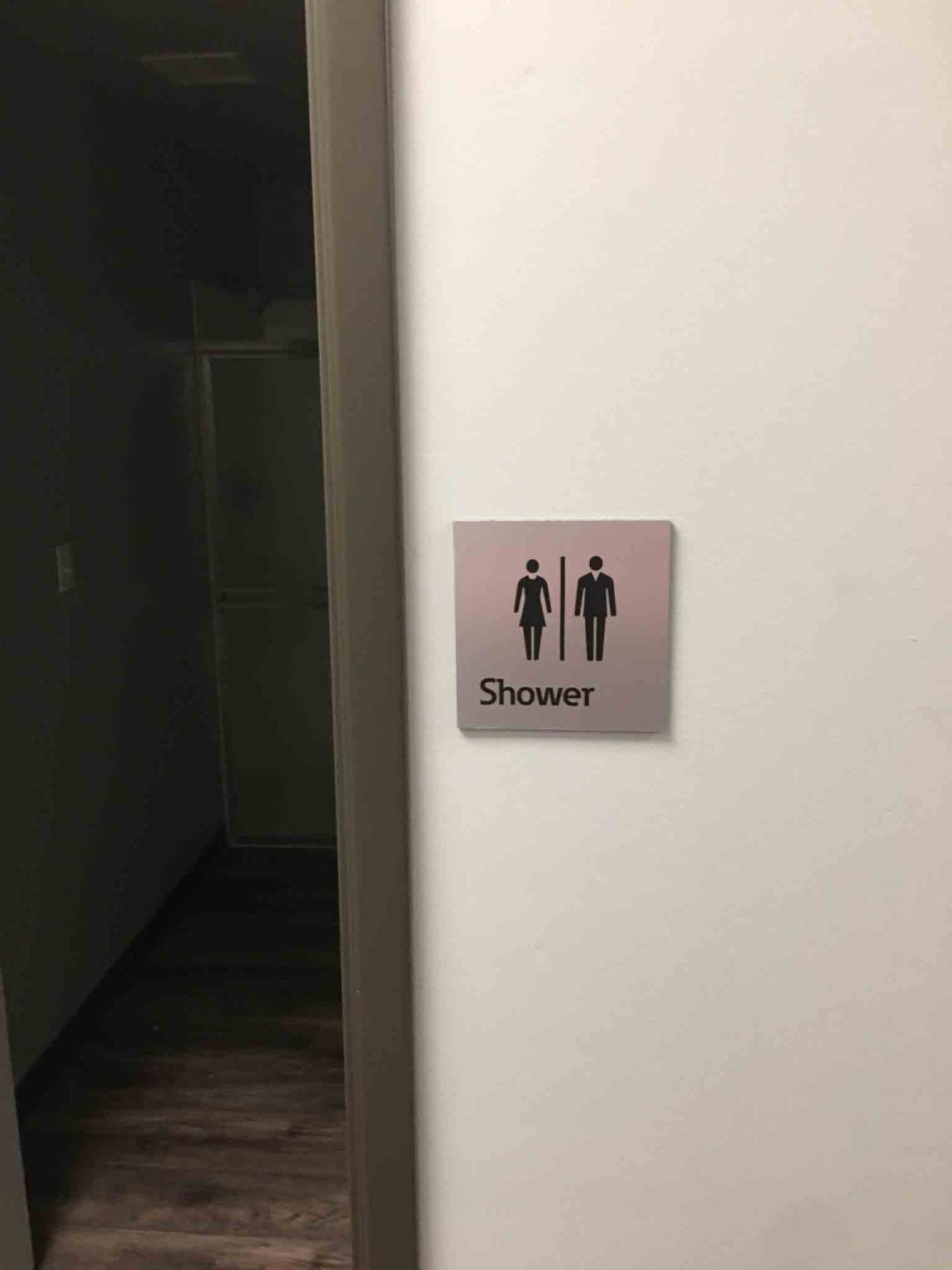
If your sign includes a picture, in this instance referred to as a pictogram, the text should not be in the same field as the pictogram. Also, the pictogram should have a 6-inch minimum field height. This will allow the pictogram to be seen from a distance.
Get ADA Signs for Your Business Today
These are only a few of the requirements for ADA signs, but never fear. Designing and installing these interior signs doesn’t have to be difficult. If you’re ready to get quality ADA signs for your business, contact 303 Sign Company today for a free quote.
Back


