Sign Design Longmont, CO: Readability, Contrast, And Compliance
Great sign design starts with one promise: people can read it fast. In Longmont’s busy streets, drivers and pedestrians only have a second or two to take in your message. Clear wording, short copy, and a strong visual hierarchy help your brand get noticed and remembered. When we design business signs in Longmont, CO, we focus on the viewer’s journey—what they notice first, what they understand next, and what action they take. Readable signage boosts wayfinding, improves safety, and turns casual glances into real foot traffic.
Choosing Legible Typography And Layout
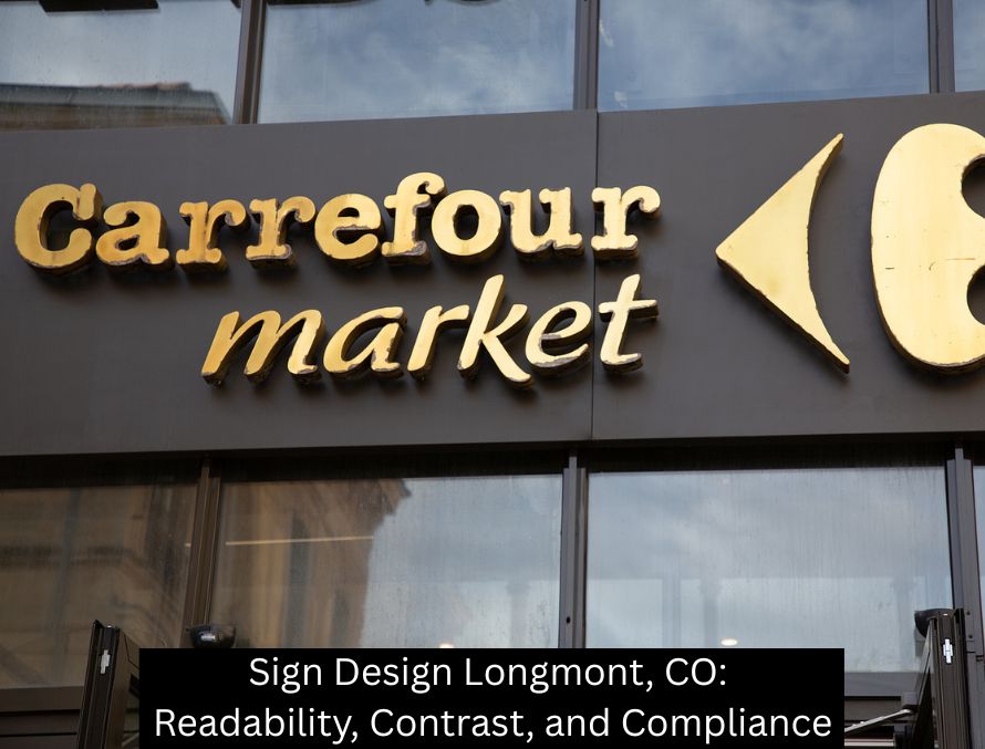
Typeface selection matters. Simple, well-proportioned sans-serif fonts usually perform best for storefront sign design and exterior signage. Adequate letter spacing prevents characters from blending together, while generous line spacing keeps multi-line messages comfortable to scan. Avoid competing fonts and overly decorative scripts for primary messages. Place the most important text at the top or center, keep taglines secondary, and leave good margins so letters “breathe.” For professional sign design in Longmont, CO, this balanced layout makes every character work harder.
Contrast And Color That Work In Colorado Light
Colorado’s bright sun can wash out weak color choices. High-contrast color pairs—like dark text on a light background or light text on a matte dark field—stand up better at a distance and in changing daylight. Brand colors still lead the palette, but we tune tones so they pop on actual materials, not just on a screen. A matte or low-glare finish further improves readability for outdoor signs and window graphics. Strong contrast improves ADA sign visibility too, supporting inclusive environments in offices, clinics, schools, and public spaces.
Visibility, Viewing Distance, And Letter Height
Legibility depends on how far away people are when they first see your sign. As viewing distance increases, letters must scale up. Clean strokes, bold weights, and uncluttered backgrounds help from across a parking lot or a multi-lane road. For interior wayfinding signs, shorter distances allow for smaller letter heights—but clarity still rules. We also consider approach speed for drivers, sightlines from sidewalks, and nighttime visibility under ambient or dedicated lighting. The result: readable signage that performs in real-world conditions across Longmont.
ADA, Code, And Permitting: Designing For Compliance
Compliance is part of smart sign design, not an afterthought. ADA signage involves clear text, tactile characters where required, proper placement, and strong contrast. Exterior signs must also align with local code and permitting in Longmont, CO, including size, placement, illumination, and zoning considerations. A compliant sign plan protects your timeline, avoids costly rework, and supports accessibility. When your signs meet ADA and city rules, you get consistency, safety, and a smoother approval process—while keeping brand presentation sharp and professional.
Materials, Finishes, And Lighting That Boost Clarity
Material choice affects how your message reads all year. Aluminum, acrylic, high-grade vinyl, and dimensional letters each interact differently with sun, shade, and snow. Backlit or front-lit channel letters provide crisp nighttime legibility for retail and restaurants, while halo-lit options offer a sophisticated, softer glow. For interior sign design, non-glare finishes prevent reflections under LEDs and skylights. Durable, well-finished materials protect color fidelity and letter edges, so your sign stays readable and on-brand long after installation.
Brand Consistency Without Sacrificing Legibility
Your signs should look like your brand—logo, colors, tone—yet still read instantly. That balance is the art of custom sign design. We adapt logos for physical scale, refine color values for contrast, and build a clear hierarchy so your name and CTA lead the message. Consistent signage across storefronts, vehicles, and interiors creates a unified customer experience. From monument signs to lobby signs and window graphics, strong brand systems help customers recognize you faster and trust you more.
Common Sign Design Mistakes To Avoid
Clutter is the enemy. Too many words, too many colors, or too many effects distract from your core message. Low contrast, thin letter strokes, or glossy backgrounds can reduce readability in Colorado sunlight. Overly small logos or phone numbers waste valuable impressions. Ignoring ADA and local rules risks delays. The fix is simple: focus the content, strengthen contrast, scale typography for distance, and design with compliance in mind. Clean, confident sign design earns attention and respect in Longmont’s competitive market.
Partner With 303 Sign Company In Longmont, CO
If you want readable, high-contrast, code-compliant signage that reflects your brand, partner with 303 Sign Company. We specialize in professional sign design in Longmont, CO—from storefront signs and channel letters to ADA signage and interior wayfinding. Our team aligns typography, color, materials, lighting, and local compliance to deliver custom signs that work in real life, not just on paper. Ready to upgrade your business signs in Longmont? Connect with 303 Sign Company, and let’s design signage that customers see, understand, and act on.
Back